Location
-

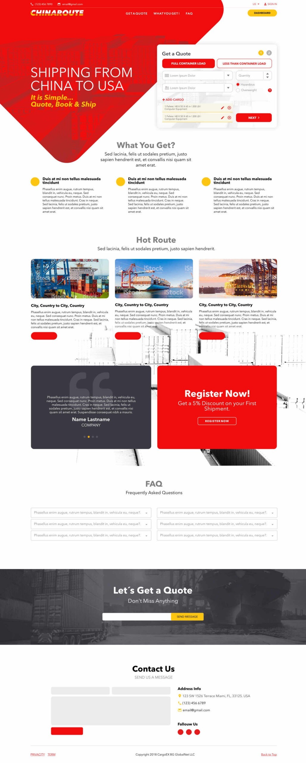
It is a corporate B2B (Business to Business) landing page for a freight forwarding company between China and the USA. The design uses a very aggressive and direct color palette: red, white, black, and gray. It is a classic scheme for the logistics sector because it conveys speed, urgency, and authority (very similar to brands like FedEx or DHL).
Explore other WordPress sites and WooCommerce stores we've designed and built.
This is how we approach every project — design, development, and results that hold up. If you want something similar, let's talk.