Location
United States

An Industrial, Functional Aesthetic Built on Clarity and Efficiency
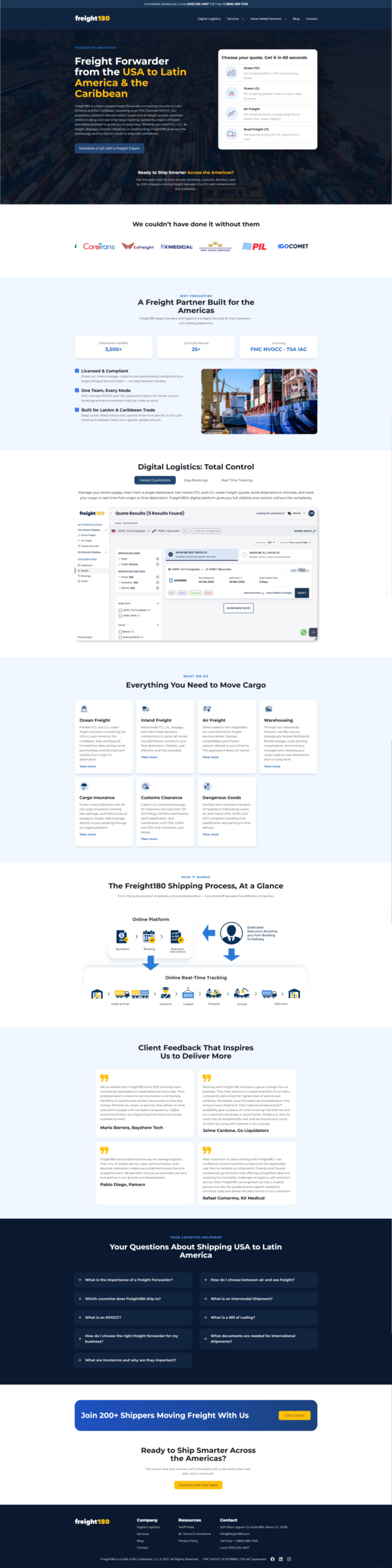
We developed the visual interface for Freight180, a platform dedicated to logistics and freight transportation. The website showcases a robust and modern design language, translating the solidity of the industry into a clear and direct digital experience. The color palette uses dark tones, metallic grays, and orange accents, creating an atmosphere of trust, dynamism, and professionalism that connects with a corporate audience. Through a focused design approach, we crafted a fluid user journey that prioritizes information accessibility. The layout uses a compact, structured grid system, with legible typography and prominent calls to action. High-quality visual elements and simple transitions ensure a consistent visual experience across all devices, resulting in a solid digital portfolio that positions Freight180 as a benchmark in transportation solutions, reinforcing their brand identity through a functional and straightforward visual aesthetic.
Explore other WordPress sites and WooCommerce stores we've designed and built.
This is how we approach every project — design, development, and results that hold up. If you want something similar, let's talk.